“Let’s Dance”
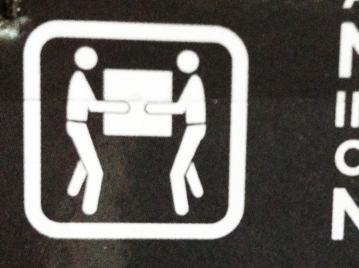
We love pictorial warnings at Lawhaha.com, as shown by the samples here, here, here, here, and here. These are supposedly universal warnings designed to be understood by everyone. As in these warnings on the outside of a dehumidifier box, they are often accompanied by written warnings. But not everyone can read the written warnings, either because of language barriers or simply an inability to read.
So how do these pictorial warnings rate? When I look at the first one, all I can think of is the David Bowie song, “Let’s Dance.” What is it trying to convey? That you need two people to pick the thing up. I think that one probably works, assuming for the sake of argument that people need a warning not to pick up large heavy objects without assistance.
 These next three warnings on the same box are a mixed bag. No idea what “4” stands for. Assuming it’s something on a scale, but “4” out of what? And what is it measuring? Please send word. The second one might be a warning to not put your wine glass on the dehumidifier, but, on the outside packaging, it’s probably a warning that the contents are breakable. The third one? Who knows? Don’t stomp on it? Don’t kick it? Hmm, maybe don’t stand on it, which I could see, but if that’s the case, shouldn’t they have a box under the boot?
We like to have fun with these, but let’s face it, the real problem is that it’s almost impossible to meaningfully convey most product warnings via a symbol.


I think the warning with “4” on it means “Do not stack more than 4 units on top of each other”.